


 How to change radio screen design / How to use Screens Settings menu
On color display / touch panel model, you can change the design of the radio's main screen.
Here, we will introduce how to change the screen design of OpenTX/EdgeTX radio (EdgeTX Ver2.8.x).
Major color display models include RadioMaster TX16s, T16, FrSky Horus x10s, Horus x12s, Jumper T16, Flysky PL18, NV14, EL18 e.t.c..
このページを日本語で見る
Table of contents
Items that can be customized
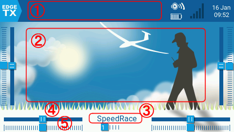
- Top bar widget
- The part (1) in the figure is called the top bar. You can put various widgets here. You can also hide the top bar itself. You can have one top bar per model.
- Main view widget
- The part (2) in the figure is called the main view. You can put various widgets here. You can have multiple main views per model (up to 4 pages). You can choose whether to display the top bar for each main view.
- Flight mode name display
-
The part (3) in the figure shows the name of the currently selected
flight mode
. You can hide this display.
You can select whether to display flight mode name for each main view.
By the way, the status of 6-position switch is displayed below here. - Trim display
- The part (4) in the figure shows the current trim state. You can hide this display. There are four trims display, one on each side of the screen and two on the bottom of the screen. You can choose whether to display the trims for each main view.
- Dial/Slider display
- The part (5) in the figure shows the current dial (Pot: Potentiometer)/slider status. You can hide this display. Alongside the trims, there are four sliders display, one on each side of the screen and two on the bottom of the screen. You can choose whether to display the sliders for each main view.
- Theme Selection: Change Color Scheme
- You can change the color scheme of each setting screen, including main screen. The color scheme is grouped into a LUT (Lookup Table) called "theme", and the entire color scheme changes collectively by switching the theme.
- Background image
- You can replace the background image of the main screen. Background images are defined per theme. For information on how to change the background image, please refer to How to set or change Splash Screen / Background Image / Model Image .
What is a widget
A widget is a word that means something like "a small part or device", and is a small application that can be placed on the screen. There are various types of widgets, from those that simply display specified characters to those that graphically display information such as radio's parameters and telemetries.The entity of widget is a Lua script embedded in OpenTX/EdgeTX or stored in the "WIDGETS" folder of microSD card. Each folder under the "WIDGETS" folder corresponds to one widget. Each widget folder contains at least one script "main.lua".
You can download additional widgets for OpenTX/EdgeTX that are open to the public, or develop your own widgets.
Lua script for beginners
Widgets (EdgeTX User Manual)
OpenTX widgets (github)
Widget Scripts (OpenTX)
Widget Scripts (EdgeTX)
What is a theme
A theme is a set of background images and color schemes for each element displayed on OpenTX/EdgeTX. The entity of theme is image files and a text file in YML format stored in the "THEMES" folder of microSD card. Each folder under the "THEMES" folder corresponds to one theme. Each theme folder contains multiple background images prepared for each display resolution, sample images, and a YML format text file named "theme.yml". The YML format file contains the name of the theme and its color scheme information.You can download additional themes for OpenTX/EdgeTX that are open to the public, or create your own themes.
EdgeTX themes (github)
To start customizing the screen
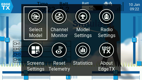 If you tap the top bar (touch panel model) or click [ENTER] key on the main screen, a menu like this (main navigation menu) will appear.
You can scroll the menu by press cursor keys, etc. or dragging screen left or right.
If you tap the top bar (touch panel model) or click [ENTER] key on the main screen, a menu like this (main navigation menu) will appear.
You can scroll the menu by press cursor keys, etc. or dragging screen left or right.
Select "Screens Settings" to start screen customization.
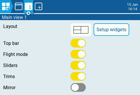 Then the screen will look like this.
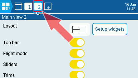
Here you can customize the default main view screen (Main view 1).
Then the screen will look like this.
Here you can customize the default main view screen (Main view 1).
[Top bar], [Flight mode], [Sliders], [Trims] switches allow you to choose whether or not to display the top bar, flight mode name, sliders and trims in this main view.
In [Layout] field, you can select the layout method of the widget.
[Mirror] switch allows you to flip the layout of the widget horizontally.
Selecting [Setup widgets] button allows you to place widgets in the main view.
For more information on how to place widgets, see Placing widgets in main view below.
 If you press [PAGE] key or tap
 icon on the screen above, you will see a screen like this.
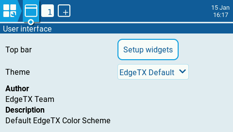
Selecting [Setup widgets] button in Top bar field allows you to place widgets on the top bar.
Drop-down list in Theme field allows you to apply the theme you want.
See Placing widgets on top bar for details on how to place widgets, and Switching themes on how to select a theme below.
Placing widgets in main view
Placement of widgets in main view is operated on this screen.
If you select
 in the [Layout] column...
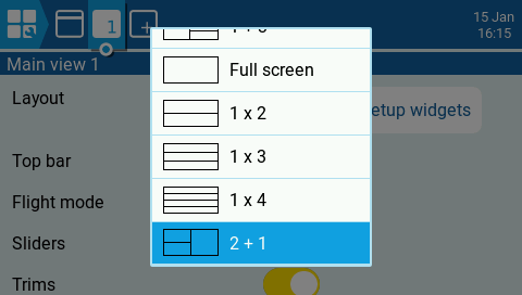 You will see these options.
You can choose placement layout of widgets.
Widgets can be arranged in a maximum of 2 columns horizontally and 4 rows vertically.
Changing the placement layout will remove all previously placed widgets.
You will see these options.
You can choose placement layout of widgets.
Widgets can be arranged in a maximum of 2 columns horizontally and 4 rows vertically.
Changing the placement layout will remove all previously placed widgets.
With [Mirror] switch on the screen above, you can flip the layout of the widget horizontally.
After deciding on the placement layout, push [EXIT] key, select [Setup widgets] button on the screen above.
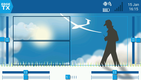 Then the screen will look like this.
A rectangular frame is displayed where the widget can be placed.
And the currently selected frame is surrounded by a dotted line.
Tap the frame where you want to place the widget.
Then the screen will look like this.
A rectangular frame is displayed where the widget can be placed.
And the currently selected frame is surrounded by a dotted line.
Tap the frame where you want to place the widget.
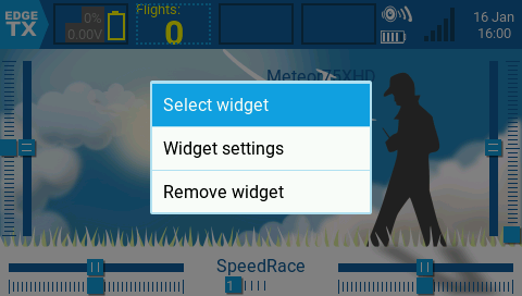
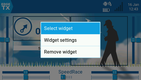 Tap the frame where you want to place the widget or press the [ENTER] key to display a menu like this.
Select [Select widget] to place a new widget.
Select [Widget settings] to configure detailed settings for the widget placed in the currently selected frame.
Select [Remove widget] to remove the widget placed in the currently selected frame.
However, if no widgets are placed in the currently selected frame, only [Select widget] can be selected. Also, if you press [EXIT] key on this screen, you will return to the main view edit screen.
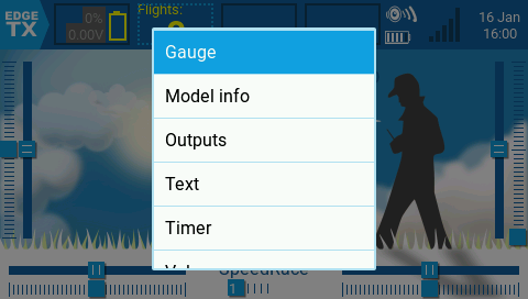
 If you select [Select widget] on the screen above, you will see a screen like this.
A list of selectable widgets is displayed, so select the widget you want to place from this list.
Then the detailed settings screen for that widget will open.
Press [EXIT] key to exit placement and return to the main view edit screen.
If you select [Select widget] on the screen above, you will see a screen like this.
A list of selectable widgets is displayed, so select the widget you want to place from this list.
Then the detailed settings screen for that widget will open.
Press [EXIT] key to exit placement and return to the main view edit screen.
See Introducing Widgets for details on each widget.
Add/delete main view screen
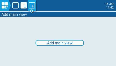 You can add multiple main view screens to one model.
Enter "Screens Settings" screen and select
You can add multiple main view screens to one model.
Enter "Screens Settings" screen and select
 icon on the top bar.
Then you will see a screen like this, so select "Add main view".
icon on the top bar.
Then you will see a screen like this, so select "Add main view".
 A new main view screen will be added immediately and its edit screen will open.
To see the screen added here while flying, press [PAGE] key.
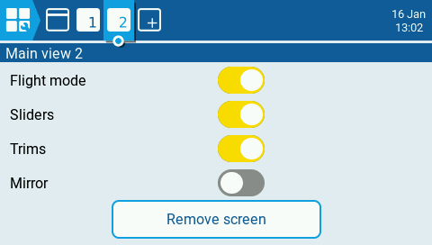 When multiple main view screens are created, a "Remove screen" button appears at the bottom of each main view edit screen.
Selecting this will delete the main view screen.
When multiple main view screens are created, a "Remove screen" button appears at the bottom of each main view edit screen.
Selecting this will delete the main view screen.
Placing widgets on top bar
Enter "Screens Settings" screen and select
icon on the top bar.
Then you will see a screen like this.
If you select [Setup widgets] button in the top bar field....
 Then the screen will look like this.
A rectangular frame is displayed where the widget can be placed.
And the currently selected frame is surrounded by a dotted line.
Up to 4 widgets can be placed on the top bar.
Tap the frame where you want to place the widget.
Then the screen will look like this.
A rectangular frame is displayed where the widget can be placed.
And the currently selected frame is surrounded by a dotted line.
Up to 4 widgets can be placed on the top bar.
Tap the frame where you want to place the widget.
 Tap the frame where you want to place the widget or press the [ENTER] key to display a menu like this.
Select [Select widget] to place a new widget.
Select [Widget settings] to configure detailed settings for the widget placed in the currently selected frame.
Select [Remove widget] to remove the widget placed in the currently selected frame.
However, if no widgets are placed in the currently selected frame, only [Select widget] can be selected. Also, if you press [EXIT] key on this screen, you will return to the top bar edit screen.
 If you select [Select widget] on the screen above, you will see a screen like this.
A list of selectable widgets is displayed, so select the widget you want to place from this list.
Then the detailed settings screen for that widget will open.
Press [EXIT] key to exit placement and return to the top bar edit screen.
If you select [Select widget] on the screen above, you will see a screen like this.
A list of selectable widgets is displayed, so select the widget you want to place from this list.
Then the detailed settings screen for that widget will open.
Press [EXIT] key to exit placement and return to the top bar edit screen.
See Introducing Widgets for details on each widget.
Switching themes
Enter "Screens Settings" screen and select
icon on the top bar.
Then you will see a screen like this.
If you tap drop-down list in the Theme field...
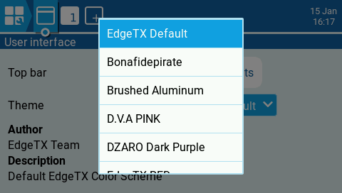 The screen will look like this.
A list of selectable themes will be displayed, so select the theme you want to apply from this list.
The screen will look like this.
A list of selectable themes will be displayed, so select the theme you want to apply from this list.
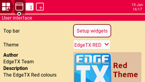 Then the selected theme will be applied.
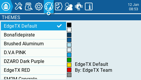 You can also switch themes on [THEMES] screen of "RADIO(SYSTEM) menu".
Basics of OpenTX/EdgeTX radio operation
Introducing Widgets
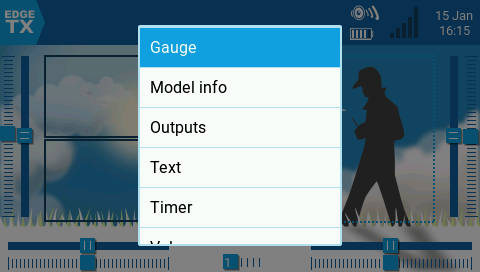
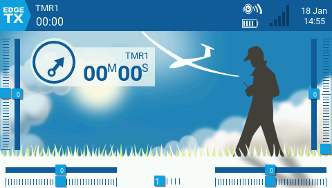
Here we introduce 6 types of widgets built into OpenTX/EdgeTX (EdgeTX Ver2.8.x). You don't need Lua scripts on your microSD card to use these widgets.In the sample image below, same widget is specified for top bar and main view. Also, "Full screen" is specified for layout of the main view.
Widgets other than those introduced here can be read on the EdgeTX User Manual page below.
Widgets (EdgeTX User Manual)
Gauge
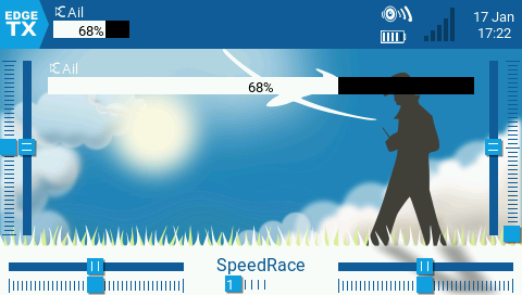 Displays the value of the specified input source as a bar graph.
The input value is converted to the range of 0%~100%.
Displays the value of the specified input source as a bar graph.
The input value is converted to the range of 0%~100%.
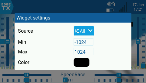 This figure shows the detailed setting screen of the Gauge widget.
In Source field, select the input source to display.
In Min field, specify the input value to treat as 0% .
In Max field, specify the input value to treat as 100% .
In Color field, specify the text color.
Model info
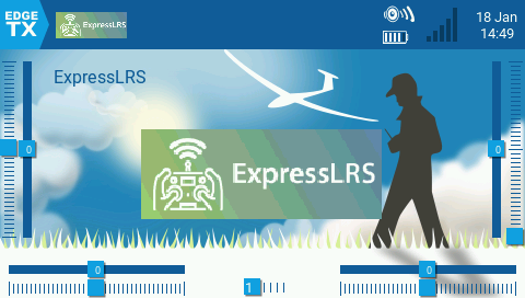 Displays the name and image of currently selected model.
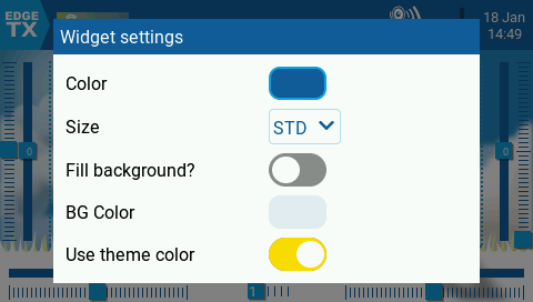 This figure shows the detailed setting screen of the Model info widget.
In Color field, specify the text color.
In Size field, specify the font size .
In Fill background? field, specify whether to fill background of the widget.
In BG Color field, specify the color to fill the background.
If Use Theme Color field is turned on, the text color will be the same as the currently selected theme.
Outputs
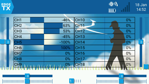 Displays the output value of each channel from the transmitter in a bar graph.
The output value is displayed in the range of -100%~100%.
This widget cannot be displayed on the top bar.
Displays the output value of each channel from the transmitter in a bar graph.
The output value is displayed in the range of -100%~100%.
This widget cannot be displayed on the top bar.
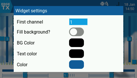 This figure shows the detailed setting screen of the Outputs widget.
In First channel field, specify the channel number to display. Up to 18 channels will be displayed, starting with the channel number you specify here, according to the widget size you choose.
In Fill background? field, specify whether to fill background of the widget.
In BG Color field, specify the color to fill the background.
In Text Color field, specify the text color.
In Color field, specify the color of the bar graph
Text
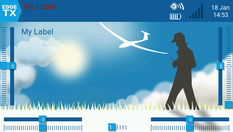 Display the string you specified.
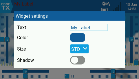 This figure shows the detailed setting screen of the Text widget.
In Text field, specify the text to be displayed.
In Color field, specify the text color.
In Size field, specify the text size.
If Shadow field is turned on, the characters will be shadowed.
Timer
 Graphically displays
timer 1/2/3
values set in the model.
Graphically displays
timer 1/2/3
values set in the model.
 This figure shows the detailed setting screen of the Timer widget.
In Timer source field, specify the timer to display.
The display colors follow the theme set for the model.
Value
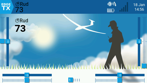 Displays the value of the data you specified as a number.
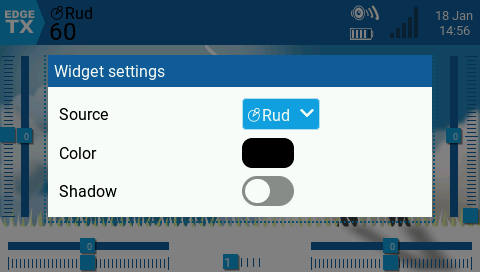 This figure shows the detailed setting screen of the Value widget.
In Source field, select the input source to display.
In Color field, specify the text color.
If Shadow field is turned on, the characters will be shadowed.
| name | overview |
|---|---|
| BattAnalog | Displays total remaining battery power obtained by telemetry with an illustration of the battery. |
| BattCheck | Displays individual remaining battery level obtained by telemetry with an illustration of the battery. |
| BattCheckAn | Displays total remaining battery power obtained by telemetry with an illustration of the battery. |
| Flights | Count your flights. One flight counts up when telemetry is enabled and throttle is held above 25% for 30 seconds or longer. The number of flights is stored in global variable GV9. You can read more about the detailed count conditions in EdgeTX User Manual . |
| Gauge Rotary | Displays the value of your specified input source with an illustration of an analog meter. |
| Ghost | Displays receiver or VTX telemetry data. |
| showal (ShowItAll) | A widget that displays all the main information on one screen. You can read more about it on OpenTx Clinic . |
| SoarOTX / SoarETX | A widget that displays various information for radio-controlled gliders. You can read more about it on SoarOTX wiki (github) . |
| Timer2 | Display the value of timer 1/2/3 set in the model in text. |
| TxGPStest | A widget that displays GPS information in text. |
| Counter | A sample for widget developers. It is a widget that simply counts numbers continuously. |
| Event Demo | A sample for widget developers. It is a widget that introduces how to use key input and touch panel input, and how to call another Lua script. |
| LibGUI Demo | A sample for widget developers. It is a widget that introduces how to use the library "LibGUI". |